Tuesday, 28 May 2013

Creating the Animation.

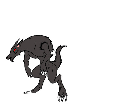
The first thing i had to do was draw out my characters again but this time in separate parts.

After i had my parts i had to convert them into symbols so they become animation freindly.

After converting them i put the piece together to create my character. Then use the bone tool to draw the skeleton inside my character.

I then correct any over lapping of body parts the bone tool creates. I also had to add constraints to certain joins because they were to flexable.

i am now ready to animate all i have to do is move the joint where i want it and simply set a keyframe.

For the run cycle i used a template of a dog run cycle as a guide.


A guide was also used for Red riding hoods walk sequence. which i edited to give her a more confident walk.


Tim Burton

Timothy Walter "TimBurton (born August 25, 1958) is an American film directorfilm producerwriterartist and animator. He is famous for his dark, gothic, macabre and quirky take on horror and fantasy style movies such as BeetlejuiceEdward ScissorhandsThe Nightmare Before ChristmasEd WoodSleepy HollowCorpse BrideSweeney Todd: The Demon Barber of Fleet StreetDark Shadows and Frankenweenie, and for blockbusters such as Pee-wee's Big AdventureBatman, its first sequel Batman ReturnsPlanet of the ApesCharlie and the Chocolate Factory and Alice in Wonderland


* Tim burtons animations are very interesting because he keeps the same dark, quirky horror theme but all his animations are different. It was good for me to see how he plays with the looks of his characters, colours and the surrounds.

Eniola

Little Red Riding Hood Film 2011


Red Riding Hood is a 2011 American dark fantasy, thriller, and horror film directed by Catherine Hardwicke, produced by Leonardo DiCaprio and starring Amanda Seyfried as the title role, from a screenplay by David Leslie Johnson.
The film is very loosely based on the folk tale Little Red Riding Hood  collected by both Charles Perrault under the name "Le Petit Chaperon Rouge" (Little Red Riding Hood) and several decades later by the Brothers Grimm as "Rotkäppchen" (Little Red Cap). 
* Even thought we have choose not to use live action in our project i still think its important to acknowledge this version of the story as i fits in with our theme. The film creates it dark tone with its narrative, the location, lighting, colours and the visual look of the wolfs.

Eniola

Brothers Grimm


The Brothers Grimm (GermanBrüder Grimm or Die Gebrüder Grimm), Jacob (1785–1863) and Wilhelm Grimm (1786–1859), were German academics, linguists, cultural researchers, lexicographers and authors who together collected and published folklore. They are among the most well-known storytellers of German folk tales, popularizing stories such as "Cinderella", "The Frog Prince", "Hansel and Gretel" (Hänsel und Gretel), "Rapunzel",, and "Snow White". Their first collection of folk tales,Children's and Household Tales, was published in 1812.


A mother asks her daughter to bring provisions to her grandmother living in the woods. Mom tells her daughter not to talk to strangers, but Little Red disobeys and speaks to a charming stranger, a wolf.

The wolf persuades her to dally in her journey, while he rushes to her grandmother's house. There he swallows grandmother whole before posing as her in an effort to trick Little Red Riding Hood. When she starts to catch on to the ruse, he swallows her whole as well.
Along comes a huntsman, looking to shoot wolves. Finding the wolf asleep in Grandmother's bed, he suspects the wolf may indeed have eaten Grandma and cuts open the wolf's stomach to find out. There he finds both Grandma and Little Red Riding Hood and rescues them before killing the wolf.

This Brothers Grimm version of Little Red Riding Hood doesn't end there. They flash forward to another time when Little Red encounters a wolf, only this time she acts more intelligently. This time she and Grandma conspire to successfully kill this 2nd wolf themselves.


*After reading the Brother Grimm version i can see the darker tone they have created in this version of the story. There is a lot more gore and violence which isn't directly told in the nursery version i grew up with.

But i was good to see what they had changed certain aspect of the story. and as our theme  is the darker side to this story we could maybe use parts of this as inspiration in our version of the story. 

Eniola

Little Red Riding Hood background

"Little Red Riding Hood", also known as "Little Red Cap" or simply "Red Riding Hood", is a French and later European fairy tale about a young girl and a Big Bad Wolf. The story has been changed considerably in its history and subject to numerous modern adaptations and readings. The story was first published by Charles Perrault.

The origins of the Little Red Riding Hood story can be traced to versions from various European countries and more than likely preceding the 17th century, of which several exist, some significantly different from the currently known, Brothers Grimm version. 

There are many different version of this story but the general plot revolves around a little girl who always wore red (little red ridding hood) her mother asked her to deliver something to her grandmother who lived on the other side of the woods. Her mother warned her not to talk to strangers on her journey. On her way to her grandmothers house she stopped to pick up flower for her. This is when she was approached by the wolf who had plans to eat her. Forgetting what her mother told her about talking to stranger she told the wolf her plans. This is when the wolf decide he would eat her grandmother too. The wolf runs to the grandmothers house and eats her, climbs into her bed and waits for the little girl to arrive.
When the little girl arrives she notices that her grandmother seems different, as she tries to investigate the wolf tries to eat her. A wood cutter who was passing by hears her scream and comes to her rescue. He beats up the wolf and rescues the grandma from the wolfs belly and they all live happily ever after. 

The moral of the story being don't talk to strangers, which is why it is told to children in nursery. 

Eniola

Little Red Riding Hood - Final Animation

Here is our finished piece of the recreation of "Little Red Riding Hood".


made by Anthony, Eniola, Quincy and Adnan

Monday, 27 May 2013

Evaluation: Adnan

The story which we chose to animate in the form of mixed media was the famous "Little Red Riding Hood". As a group of four, we decided on the first day who was going to be doing what and we agreed upon three different forms of media; 3D, 2D and Kinetic Typography. Anthony decided he wanted to create the forest in Maya, this involved modelling, adding textures, lighting the environment and finally rendering camera angles which took a few days to complete. Quincy's role was to design and model the house where the grandmother was to live. This house turned out very appealing, it was also done in Maya where again, textures, lights and modelling would have to have been added to achieve the desired look. Eniola preferred to design and animate our characters which was done to a high level. He used Adobe Flash which is definitely not a favourite from amongst our group but again Eniola took up the challenge and achieved a great look. I was very grateful to be doing the Typography for the group as I really enjoyed doing it in the previous assignment. The software I used was Adobe After effects.

I believe our animation has turned out a success, I really didn't think it was going to turn out so well the day we were given the assignment. I strongly believe we have a achieved the horror genre we were going for, the forest and the house is undoubtedly a spooky environment, the characters have a unique look to them especially the wolf who was designed to look evil. For the font I had originally found three different types of which were then narrowed down to the groups favourite.

Pros
- The composites of the 2D characters and 3D environments were done really well I think. Everything is positioned perfectly which gives a 3D space illusion.
- More than enough footage, I was a little worried that we wouldn't be able to hit the 2 minute mark but it turns out we passed it.

Cons
- It's a shame that our forest scene doesn't have a sky which would have made it much more effective, However, I did say that I would try and add a sky in the end in After Effects but it turned out to be too complicated to achieve.
- I am not sure if the Typography works when there is footage on screen, I did try an keep the words to a minimum but still turns out to be a distraction to the viewer.
- I also think that the narration was a bit too deep and hard to understand at certain points in the animation.

All in all I am proud of our final animation, I am impressed by what our group has been able to achieve and most definitely would have been a nightmare to attempt this individually.

Adnan.

Adding a Soundtrack

After adding final touches to our animation I really felt that it needed something to affect our viewers emotions so I started looking up some soundtracks and came across a YouTube channel called, natureandevents. This person has great videos but one in particular i thought would work well with our piece and that's the following...
 I have messaged the owner of the video and gained their permission to use their work as a faint soundtrack in our final animation.

source: http://www.youtube.com/watch?v=xNDiPhVVrZ8

Adnan.

Tuesday, 21 May 2013

Screen Grabs

These are screen grabs from my work space in after effects.


I really want to show some of the different effects I am using for the typography to make it look better. The above images show the same screen grab with different zoom levels, they show the effect of motion blur once turned on which makes it look much more appealing to the viewer.


I have also decided to use vectors in my typography to really help get the message over to the audience and as we all know a picture is worth a thousand words. These vectors were found on all-silhouettes.com

Adnan.

Background Change

After listening to what my group had to say about the test intro I have decided to change the background of our piece when there is typography on screen. We all agreed that it is distracting and less attractive if there is moving footage in the background whilst the main attention should be on the words.

So this is the image I have decided that we should use as our background. It reminds us of our forest mainly because of the staging of the trees, there are quite spaced out with a plain background and ground. The image is quite mysterious which compliments our narrative and overall characteristics of the animation.


Adnan.

Monday, 20 May 2013

Experimentation: Introduction Test

As i wait for the guys to composite their parts of the animation I have made a test Intro of my typography to see how the final piece will begin, this allows feedback from the group as to what they think works and what they think doesn't work. We know that typography will be used to open the animation so i played around with the background by using a draft sequence made by Eniola and Anthony and made it blurred so it doesn't distract the viewer from the typography.


Adnan.


Feedback.

I like some parts, I don't think the blurred background footage works. I think you should make a background that doesn't involve the scene but complements the text...maybe an open old ragedy book (still) manipulated in photoshop for the desired look, then have the text and images appearing in/on it...? Quincy.


Sunday, 19 May 2013

Anthony's final evaluation of the group project

Final Evaluation, Anthony:

Whilst working together as a group of four, myself, Qunicy, Adnan and Eniola have all contributed to what I believe to be a fantastic piece of mixed media animated work. The original theme of our project was to re-create a version of Little red riding hood which would in-corporate three separate powerful forms of animation together, the three we concluded on where 3D, 2D and Typography. We choose these particular forms of mixed media as we believe each of them bring different aspects to the table and all in all help contribute to re-creating an original version of the child hood story "Little Red Riding hood"

The initial idea and types of mixed media we were going to use were established relatively fast. After considering the forms of mixed media, we then went on to separate the three sections by delegating the 3D to the scenes, 2D to the characters and of course the Typography towards the text and narrative of the story.

Every member of the group has different skill sets. In class we discussed with one and other what we could bring to the table. After carefully considering and listening to everyone's thoughts and opinions  we were able to delegate individual roles to everyone. looking back at this form of delegation, I can safely say that it was the right thing to do as everyone was able to do something they enjoyed as well as having there own unique footprint within the final animated scene.

Eniola choose to do the 2D characters within our project which consisted of drawing and creating the characters, followed by different animated sequences which were done in flash. I personally feel that the characters are original designs which correspond well with our story. The colours he used were bold which helped enhance the overall felling of presence each character has. After carefully analyzing all the individual animated sequences, I can conclude that the animation is smooth and works well with 3D scenes which were created. In addition to the above, all the characters interact well with one and other which has seriously helped bring the scene together. The importance of the 2D aspect within our final project is obvious as the scene wouldn't make sense without it. To conclude, I feel that Eniola has contributed a great amount to our final project and has provided outstanding work which interlinks well with everyone else.

Adnan was the next to choose his preference of the different forms of mixed media. From analyzing our previous work we had completed so far this year, everyone could clearly see that Adnan had created a fantastic typography. He therefore decided to take on the role of narrating and using text to bring the story to life. Throughout the project Adnan posted several different ideas and types of typography on blogger, we as a group over viewed what he had come up with and helped him decide on a final text format as well as colours applied, scale and the narrative voice itself. He aimed to achieve something which would interact well with the rest of the animation whilst not over powering the scene's themselves. We were very weary of the presence a typography could have and therefore told Adnan to carefully consider each separate aspect of the typography carefully. The final outcome was extremely eye catching and seemed to blend in well with the 2D and 3D aspects. I myself am very fond of the font that has been used as it works particularly well with the forest. Overall I would say Adnan has created an interesting typography using a large spectrum of ideas and applied them accordingly within the scenes. His contribution within the group was of a high standard and helped motivate others along the way.

Quincy's role within the project was to create a 3D house and bedroom using any program of his choice. The main aim for Quincy was to create an interesting original fairy tale like scene which go's hand in hand so to say with my forest scene. He initially created an interesting cottage/hut like scene, however after carefully evaluating it, Quincy decided it wasn't stylized in a similar manner to that of the forest, thus deciding to redo the scene. What he then came up with was completely different original idea which instantly looked like a fairy tale house. The layout of the bricks, walls and windows were very interesting as they have been carefully placed to simulate an old run down home lived in by an elderly person. My personal favorite aspect of his scene is the textures he has applied throughout the house. You can clearly see that all the textures have been carefully put together and bounce off of one and other. In addition to this, lighting in and around the house creates interesting shadows and gives of a spooky like look upon the forest. Quincy's input towards the group project was second to none as he constantly provided opinions and solutions to many problems along the way. The final scene which he came up with was carefully thought out and interlinked well with the 2D characters, 3D forest scene and Typography.

My role within the Group was to create an interesting fairy tale forest within a 3D space. I aimed to make it as interesting as possible and therefore decided to create quite detailed trees. The first idea that came into my head was to display signs of life and death, this was done by creating dead trees along with fresh green grass. I redone my forest half way through the project as I felt the original forest wasn't able to fit in with Quincy's scene that well. This lead me to change several things ranging from textures to lighting. Once I had completed the knew scene I could clearly see that it would interact well with the house as the textures from both scenes fit well together. We then tested the forest scene by doing some composites of typography into the scene within after affects, this seemed to be a success as the typography and forest worked well together. My personal favorite aspect about the forest is the texture that has been applied to the trees as it brings everything to life. I then went on to create an original script based off of the you tube "Little Red Riding hood" version we choose. I ensured the script wasn't to long as I had to ensure each scene would fit in well in terms of timing ect. The overall story turned out to be 1 minute 35 seconds which was very similar to the version we based ours upon. To conclude, I would say my input into the project matched that of everyone else's. I gave 100% into my work and corrected many mistakes I made along the way with others help and guidance.

All in all everyone provided expertise and motivation throughout the mixed media project. We encountered and over come several obstacles which only made us stronger and learn as a group. I can personally say that I have learnt allot from the work I have done as well as the problems and mistakes I underwent. The support of my group was incredible as we were in constant contact with one and other over the phone and on blogger on a daily basis.


Forest change, comparing the new rendered forest to the old one

The initial forest which was rendered several weeks ago eventually turned out to be slightly off for what myself and my group were aiming to achieve, after careful discussion with my group I decided to go ahead and alter several things within the forest scene which included lighting, textures tree frequency, scale, positioning, camera angles and the pathway. After the completion of the house, Quincy went ahead and inserted the house into the forest scene, this brought several things to our attention, basically we needed to ensure both scenes interacted and completed one and other to a satisfactory basis. This was therefore the reason why I eventually decided to alter the entire forest.

 Now that I have re-modeled the forest, I can safely say that I am much happier with the correspondence between the house and the forest scene as the both seem to simulate that some what of a fairy tale setting. The textures in both scenes work well together as well as the density and placement of trees and grass ect. 

In comparison to the original forest I modeled, the knew one consists of a more realistic look as dandelions and bushes aren't just randomly scattered around as well as the texture UV's being more accurate producing a realistic outcome. In conclusion myself and the rest of the group are pleased with how things have turned out and are excited to composite everything and bring the final touches  together. 

Anthony 

Change My Voice App

I have come across an application called Change My Voice by Best Free Apps Intl on Google Play. This app lets you play around with a recording and change its attributes for example make the pitch lower or higher, or add echo and increase/decrease speed. I thought this may be useful as our script is fine but the narration is quite plain and dull which doesn't go very well with our genre. I want to use this app to make our narration a little deeper and maybe add an echo to it too.

Here is a video of me using the app and checking out its features. Adnan.

FINAL FOREST RENDER 1 & 2 & 3 WITH SOUND

RENDER 1: BACK OF WOLF RUNNING FAST

http://www.youtube.com/watch?v=eBl3LQTrbUw&feature=youtube_gdata

RENDER 2: PAN ACROSS VIEW: FIRST 10 SECS RED RIDDING HOOD WALKING SECOUND 10 SECS WOLF RUNNING

http://www.youtube.com/watch?v=y30sLztKHxA&feature=youtube_gdata

RENDER 3: BACK VIEW OF RED RIDING HOOD WALKING


Anthony

Wednesday, 15 May 2013

Experimentation: TypographyTest (After Effects)

Using After Effects CS6 I have created three separate tests with the different types of font I have looked at.

You will notice that the typography is not animated to every single word, only certain one, this is to keep the visuals simple so the viewer does not get distracted from the characters. When there is more thorough typography needed I will be sure to freeze and blur the animation as we have decided in our group in a previous session.

After seeing these short tests in this way i'm slightly leaning towards the October Crow font. I still haven't asked my grop what they think however I think they too will like this font.

Adnan.

Typography Fonts

My role is to make the typography for our animation and I can say that I am very excited about it. The first thing to do is to look up some fonts, after a previous assignment on typography i have found that there is a large collection of fonts on the website Dafont.com

These are 3 of which i thought can work and these are called:

Everyday Ghost

October Crow

Lazy Monk

They all are potential final fonts the trouble I am facing is picking one of them.


I particularly like the two bottom fonts, october now and lazy monk, because they will really go well with the genre we are following. 

I am going to do some tests to see which come out best and ask my group what their opinions and views are.

Adnan.

Tuesday, 14 May 2013

3D forest scene overview on final outcome

In my opinion the final version of the forest seems to be rather successful as it complies well with what I was trying to achieve, a unique looking scene which would enable and interact well with foreign objects such as 2D characters.

The scene itself is built up of various different trees each bringing additional aspects to the 3D area. Several different textures and forms of fur have been used to fill in space and bring everything together. The grass works well with the scene as it corresponds well with the surrounding objects including the trees as well as bushes and dandelions.

I choose specific textures and colours when creating my scene as I was aiming to achieve a specific look, one which gave of an intimidating dark feeling whilst also showing signs of life (dandelions) in order to interlink with the fairy tale feeling of the story, Little Red Riding hood. 

In order to achieve a successful scene, I had to ensure the forest portrayed both signs of life and death, both of which are able to link in with individual characters  the wolf representing death and red riding hood life. I portrayed these within my scene by creating dead looking trees showing no signs of life (no greenery) applied with bland textures to create darkness and fear. life was then introduced by creating greenery with grass, bushes and flowers. 

The idea of our project is to combine several forms of mixed media together, we choose to incorporate both 2D and 3D together, this therefore meant that I had to carefully choose which camera angles I wanted when rendering out my scene as I had to ensure the 2D animation could be inserted into the scene successfully  The camera angle we settled on was a pan across view as it would enable movement for the 2d character as well as showing of the forest scene.

Anthony

Little red riding hood original script plus narrated version

Scene one - Typography introduction - Narrator:

"Long ago there lived a pretty girl who always wore a red cape with a hood, she was known as little red riding hood. One day she decided to visit her grandmother who lived deep within the woodland realm, before setting of onto her journey, her mother warned her about talking to strangers"

Scene two - Woodland shot (pan across forest with red riding hood walking through)

Scene three - Woodland shot (pan across forest with big bad wolf walking threw)- Narrator:

"Deep within the forest lived a bad wolf, he saw little red riding hood passing threw and wanted to eat her up"

Scene four - Woodland shot (big bad wolf approaches red riding hood and speaks to her) - Narrator

"He was very cunning and decided to go speak to her and find out where she was going, Red riding hood foolishly told him she was on her way to her grandmothers house. The bad wolf decided to eat up her grandma first and then wait for little red riding hood in her house"

Scene five - Woodland shot (big bad wolf running to grandma's house)

Scene six - outside house shot (big wolf peaking through house window)

Scene seven - grandma's room (wolf lying in grandma's bed in her clothes) - Narrator:

"After he gobbled her up, he put on her clothes and tucked himself into her bed waiting for Red Riding hood to arrive"

Scene eight - close up of wolf on bed and red riding hood - Narrator:

"When red riding hood arrived she was surprised of her grandmothers big arms, ears and teeth. The big wolf laughed a wicked laugh"

Big wolf - "Muuuahahahahahahaaahaha!!"

Narrator - "Big wolf pounced on her in a flash, Red riding hood was very scared and screamed for help "

Scene nine - Woodcutter introduced - Narrator


"A kind woodcutter who was passing by the house heard her scream and came to her rescue"

Scene ten - Woodcutter enters bedroom - Narrator

"The woodcutter immediately hit the wolf on the head with his axe" (sound effect added)

Scene eleven - bedroom - Narrator

"The woodcutter immediately hit the wolf on the head with his axe then cut open the wolfs stomach and out came her grandmother. The big bad wolf was unable to hurt anyone again, from then on Red Riding hood remembered never to speak to strangers again"

Narration: 


Anthony


Saturday, 4 May 2013


Huntsman Design

Tell me what you guys think?

Cool, change the blue though, too colourful. Quincy.

Tuesday, 30 April 2013

Roles and responsibilities:

Adnan:

Typography

Anthony: 

Forest scene, textures lights etc 

Eniola: 

Character design and animation                                                               

Modeling of grandmothers cottage and room narrator script.


Monday, 22 April 2013

Simple Huntsman Designs


These are some simple designs for our huntsman that i thought may work well. I think he looks quite friendly which is a shame as our animation of Little red riding hood will be more of a horror genre. The huntsman is not really my role to design however i thought these may help put us on some sort of track.
Adnan. 

Saturday, 6 April 2013


Draft of the storyboard. let me know what you think needs changing or adding ?

Thursday, 4 April 2013

Original red riding hood video


http://www.youtube.com/watch?v=nKagcfjqCQk&feature=player_embedded


Yeah I think those look good. Are we going to have the wolf disguised as the grandmother as well, different angles both characters, a back view of RRiding Hood would be useful.
Quincy.


Pre visualisation:

This is a program my kids watch and may help with the pre visualisation. Without a picture it's just words so, we need to be all on the same page in order to unify our respective visions and ultimately; our contributions. At the moment I'm not quite sure how you all see the final film.

Influence:

This is a 3d and photo stills composited with 2d animation technique. Basically let me know if this is the type of thing you all envisage or not please comment on video.

Can we all post examples of how you foresee your work integrating with the other group members work. E.G. Videos/work you've already done etc
etc proof of concept...lol

Also is anyone doing a story board, I think it is vital that we have a solid one, to keep us all working with a reference.

In terms of audio are we going to have a narrator, or use found audio? I think the girl in that video sounds very boring? Also should we make a private Face book group for this type of communication?

Answers on a postcard please.
Quincy.

http://www.youtube.com/watch?v=hzCEwoKUtpA